Adrián Chrzan: not random but a complex creative process
We’re delving into the making of The Cocktail Balance 2.0, revealing the secrets, struggles, and attention to detail that go into making a book.
Learn about the glassware design in the book from Eva Polgary, the book design from Dávid Tlčimuka, and now the stunning photography from Adrián Chrzan.
Adrián is a photographer who works with top companies in Slovakia. His photos and videos are characterized by their rich texture and striking use of light. Adrián is co-owner of The Cocktail Balance company, and takes care of all the photography, videography and marketing.
What did you learn photographing the first book?
A couple of things. First of all and most importantly, even though everything can be fixed in post process, it takes an enormous amount of time and energy and the result can be disappointing. Now I take more time for the preparation, light setup and composition and then have an easy time editing it and focusing on the details in post process.
Another lesson was also that you shouldn’t always strictly follow the client/project brief; sometimes being spontaneous, trying different angles or lens for the project can be enriching in the end.
What aspect of photographing a book do most people not think about/realise?
That it is a whole organism. If you want to create a visually attractive book, you have to create a very complex idea and think about details you normally wouldn’t have to. We had a mood board, we discussed the scene lightning, and we also needed to create a visual that would match the idea of the book, its philosophy and design.
And most importantly, you are not allowed to make mistakes. You have to realize that this will be printed and will stay the same, without any additional edits like in an ebook or digital project which can be fixed any moment. If you forget to retouch something or send pictures in the wrong color profile, it can damage the whole book (which isn’t cheap to print, trust me).
What are some differences when photographing for print vs digital?
As I mentioned, once a photograph is printed, it cannot be changed. Additionally, the two formats for display function quite differently. While viewing an image on a screen, you can easily adjust the brightness and contrast. However, a printed image must look flawless under various lighting conditions. Because of these differences, I needed to create two versions of each photograph: one for print or books, using CMYK colors and a specialized printing color profile, and the other for digital use.
A difference between CMYK vs RGB setting
What goals did you have for the second book photography-wise and how did you accomplish them?
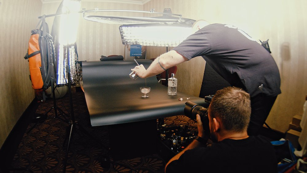
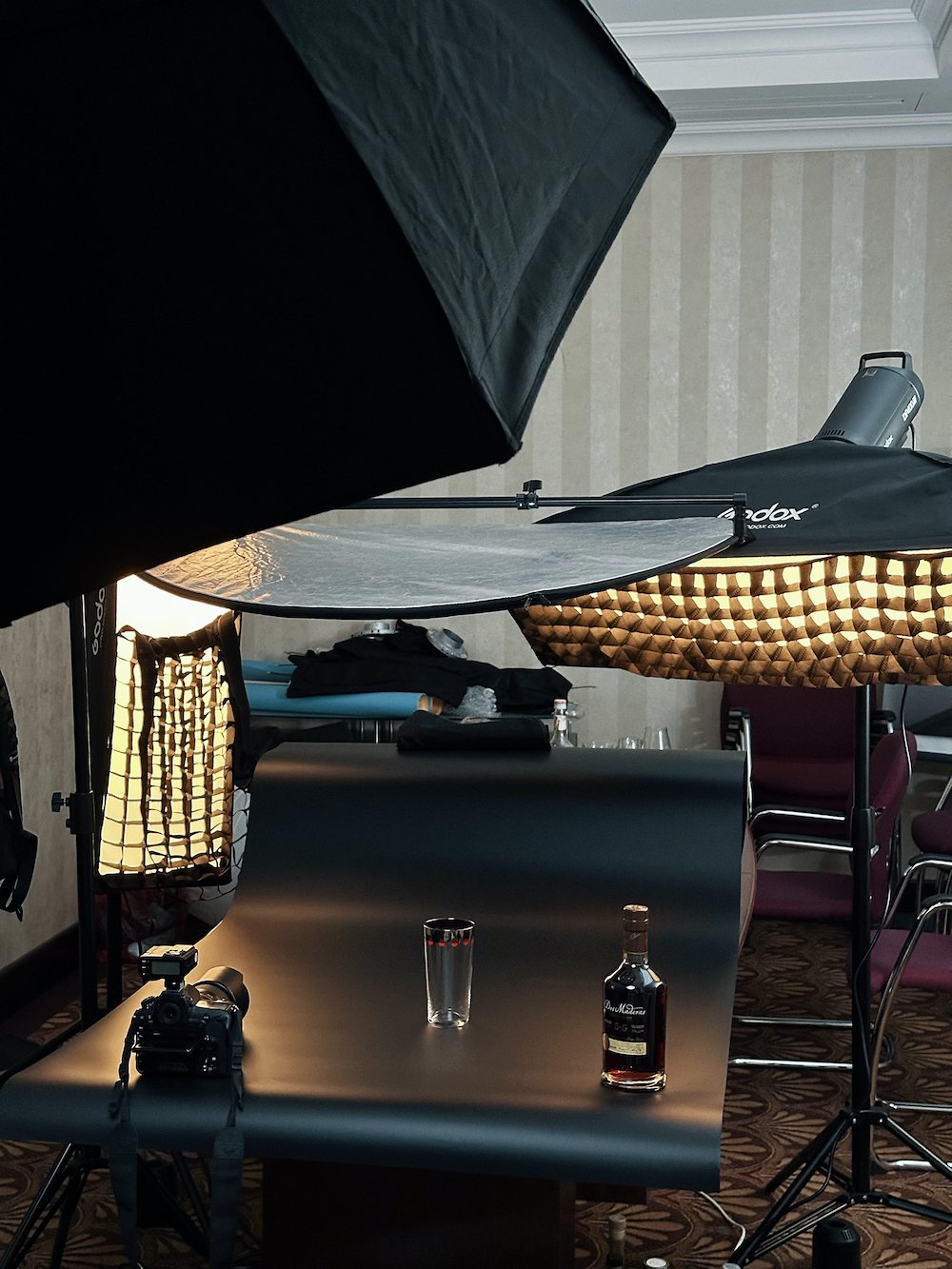
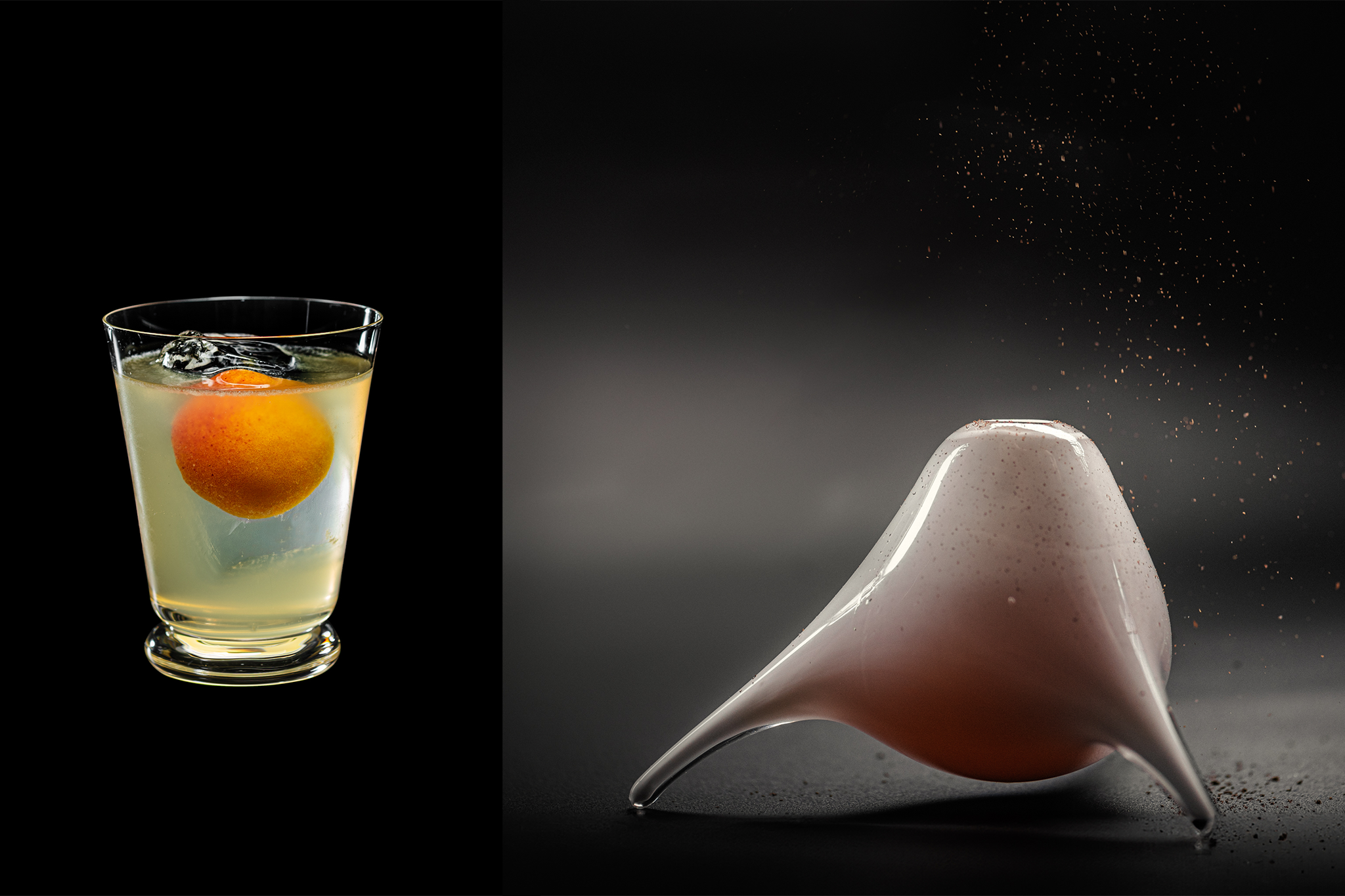
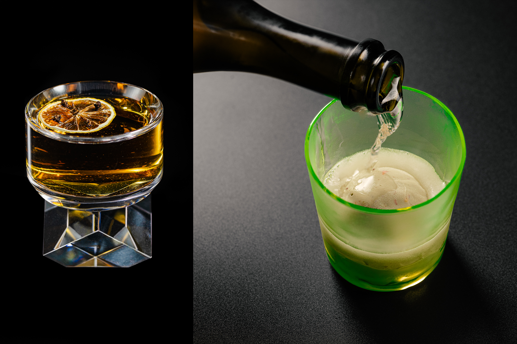
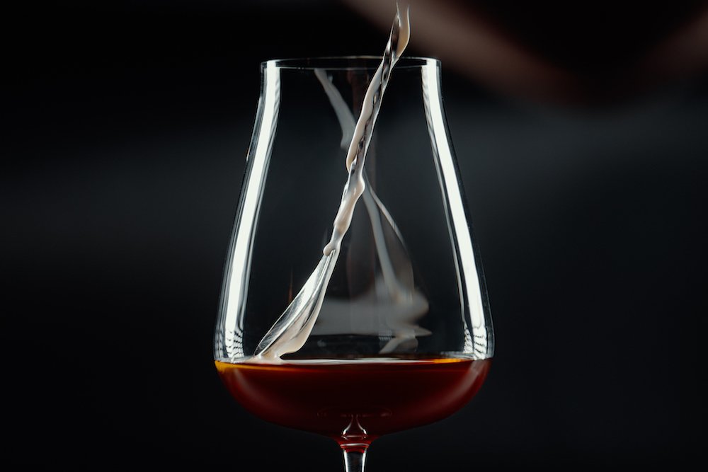
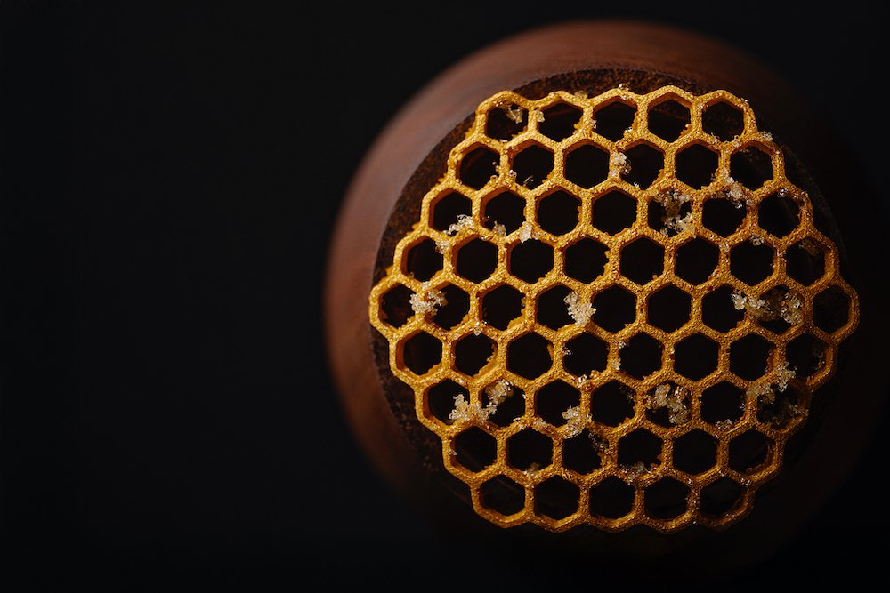
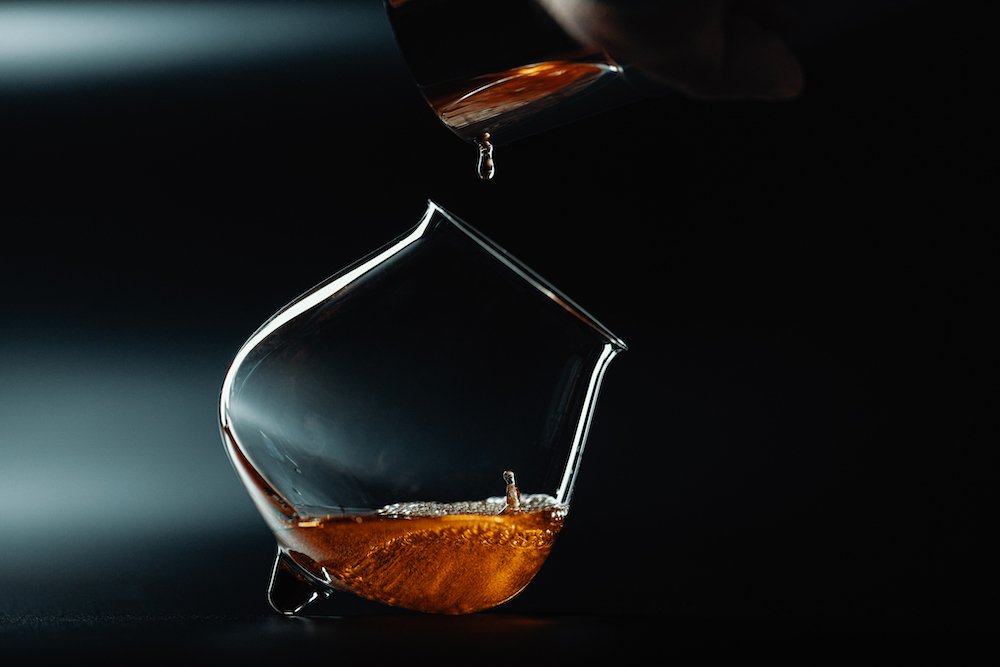
I wanted to change the whole visual of the photography and make the pictures more 3D. We decided that instead of cutting every cocktail and putting it on the same background, taking the picture from the same angle and length, we would not cut it out but instead show the reflections and structure of the background surface. This way, every cocktail has its own story and we were able to highlight it by changing angles, focal lengths of the lenses and sometimes even light setup.
All we needed to do was to look at each cocktail as something original and individual, each of them in an original glass and with different texture, garnish and emotion. I think we accomplished that much better than in the first book and that the details in this one are much more mature.
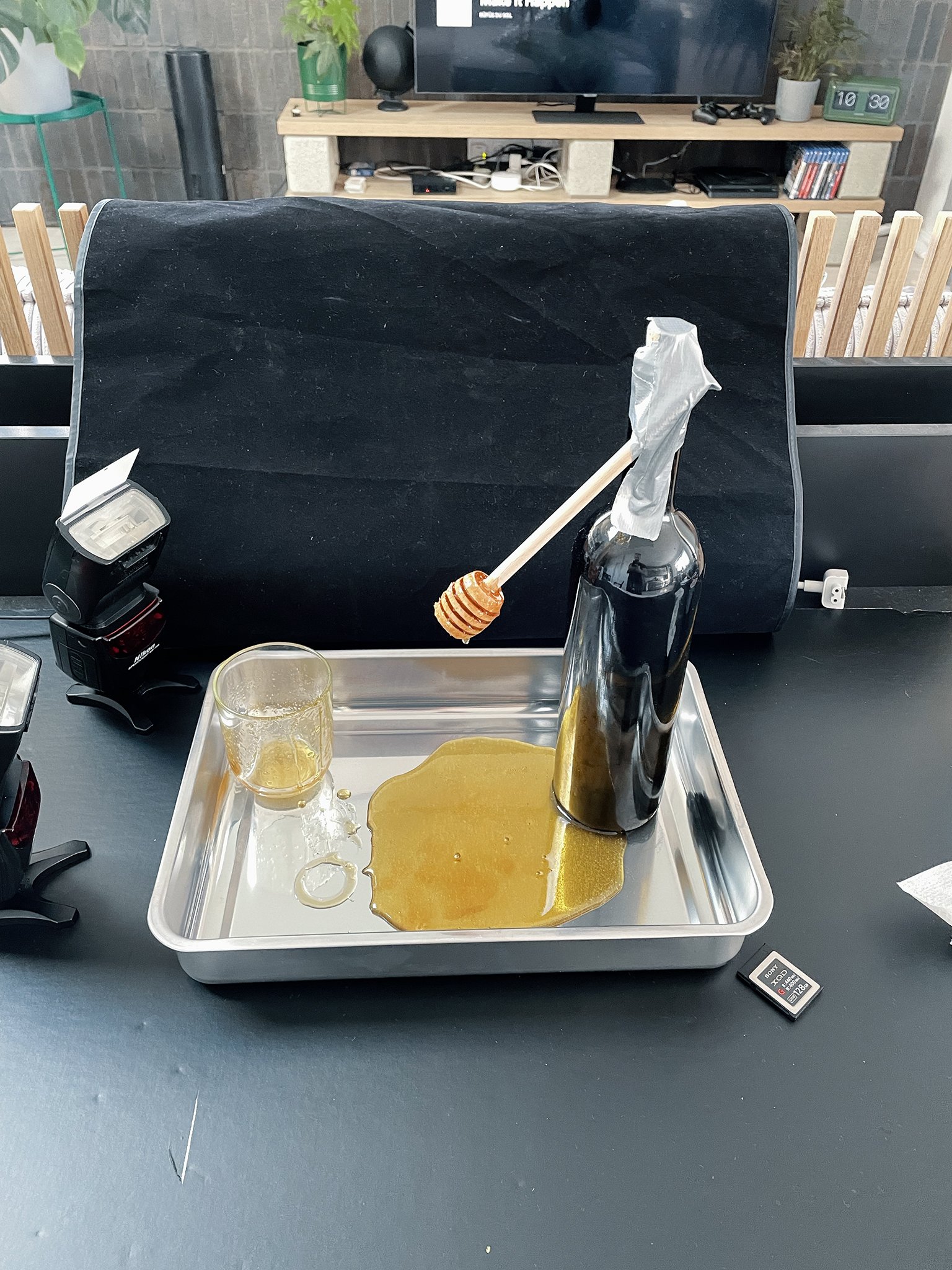
And how did I accomplish it? Well, hard work, years of experience and lots of studying about how materials reflect light, how to setup scenes etc, but also by upgrading all the gear except camera and lenses. When we were working on the first book, we took the pictures on my black computer table and used 3 camera flashes. It was pretty funny, but some of the pictures are still among my favourites.
Did the evolution of AI between the two books play a role in the second?
Yes, it did. When we were working on the first book, we wanted to include pictures of every ingredient, but some of them are seasonal. This made the process time-consuming and costly, as we needed to source high-quality items and invest additional time in post-processing and retouching the images. For the second edition, we opted to experiment with AI-generated pictures of the ingredients. While you can still tell that they were AI-generated, we wanted to try this approach to simplify my life. However, it didn’t quite work out as planned, as some of the results were quite humorous, and I ended up spending several hours crafting the perfect prompts.
Prompt: Create a 4K realistic image of a strawberry on a black background. The strawberry should have no leaves, and the lighting should come from the top and the side, highlighting the details. The texture of the strawberry should be matte and not shiny, showcasing the fine details and surface texture of the fruit. Lower the glow and add texture on the surface.
What was the hardest aspect of making 2.0?
To make it. Both Stan and I work on various projects and are most of the year overwhelmed with work, so to find 4 days just to make pictures of the cocktails was pretty hard. We finished the shooting just one day before Stan headed somewhere abroad only to find out that we needed to reshoot several cocktails because we were not satisfied with the results, meaning we were forced to ask the printing company to postpone the process so we could fix it.
I also think that we took this much more seriously. While the first book was just a project of people bored during COVID, the second book was oriented towards professionals on a global scale, so we needed to bring something much better and deeper than the first edition. I think that we are all more satisfied with the result than we were when we finished the first book.
What are you most proud of in the book?
We finished the project (almost) on time, and people appreciate it. We will soon be sold out, so we need to print more copies. I am also proud of the team, which worked under pressure and in a tight time-frame to make this happen.
Personally, I’m proud on the whole project but I need to mention the Legacy and the portraits. I wasn’t responsible for the portraits in the first book, but this time I took on that responsibility. I came up with the idea of mirroring how the brain works: the right hemisphere is responsible for creativity, artistic and musical skills, while the left side handles speech, comprehension, arithmetic, and writing.
We literally incorporated this concept into the book by showing only the right side of the face, the creative side (something we see, like their cocktails or skills), while the left side, responsible for logical processes like writing and reading, is represented by text from the bartenders. It’s a profound idea, and I know that most people might not realize that this was my intention. However, it wasn’t just a random idea, but a serious process of thinking and creating.
The Cocktail Balance and The Cocktail Balance 2.0 are available in our shop.


